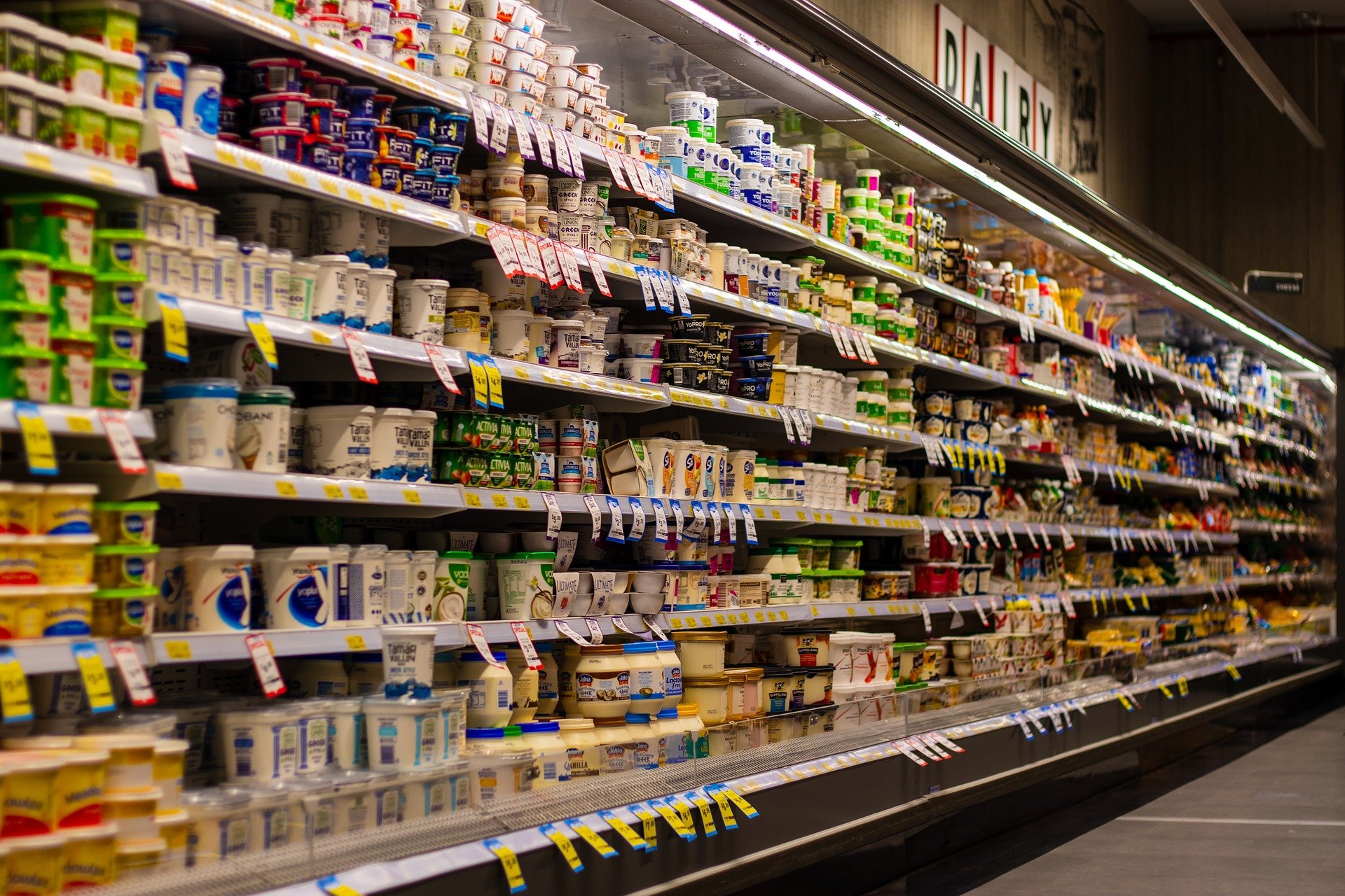
The food and beverage sector is saturated with consumer products that range from cookies and cakes to beer and soda. To stand out in a crowded market, manufacturers and marketers work to come up with eye-catching packaging.
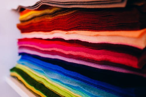
Color psychology plays a major role in the advertising and successful sales. Package color has an effect on consumers and can draw them in or put them off.
To see which colors are used the most, Electrix International , a major supplier of electrical enclosures and cable management systems, has analyzed nearly 2,500 grocery products. Here, we find out which shade is used the most to influence the buying habits of grocery shoppers.
What is the magic color?
Across 10 categories, which include cookies, chocolate, soda drinks, and ice cream, the most-used color for packaging is light gray. In fact, 20.6% of all products analyzed are packaged and marketed to consumers using this color.
The theme for less vibrant colors follows suit in second and third place, with black (11%) and dark red (8%) joining light gray in the top picks for packaging. You’re less likely to see light purple (one item), blue (three items) and lime (three items) on everyday items.
Category crunching
On closer inspection, the use of light gray tends to be complemented by dark blue and light blue for cookies and ice creams. Meanwhile, red and dark red appears mostly on coffee, cereal, and potato chips.
Using data from Walmart’s online grocery service, the name, brand, and image of up to 355 different products in ten food and beverage categories was collated, totaling 2,422 products across the range. An algorithm then analyzed colored pixels to calculate the top three colors in each product image. The following list shows a full overview of the products analyzed and the colors used to stand out on shelves:
- Candy (234 Products) – gold, orange
- Canned Food (354 Products) – light gray, dark blue
- Cereal (188 Products) – light gray, dark red
- Chocolate (27 products) – ivory, dark gold
- Coffee (355 products) – light gray, red
- Cookies (330 products) – light gray, dark blue
- Ice Creams (321 products) – light gray, light blue
- Potato Chips (269 products) – light gray, dark red
- Soda (37 products) – dark gold, green
- Tea (307 products) – dark gold, black
Just 22% of products tended to have only one color on their packaging with cereal being the most consistent category. Ice cream is most likely to have more than one color on its packaging, with dairy lovers treated to more variation on the front of their tubs and cartons.
The breakdown of product types and the amount of colors used for each is detailed below, with canned food, coffee, and ice cream very similar in terms of results.
| Product types | 2+ Color | 1 Color |
| Candy | 79.49% | 20.51% |
| Canned Food | 80.23% | 19.77% |
| Cereal | 69.68% | 30.32% |
| Chocolate | 74.07% | 25.93% |
| Coffee | 80.00% | 20.00% |
| Cookies | 78.79% | 21.21% |
| Ice Cream | 80.69% | 19.31% |
| Potato Chips | 75.09% | 24.91% |
| Soda Drinks | 72.97% | 27.03% |
| Tea | 79.15% | 20.85% |
Table of product types and the percentage amount of colors used on their packaging
What will the future bring for packaging?
A brand’s identity is closely linked to the colors it uses because colors often resonate with strong emotions. With light greys, bold blacks, and dark reds dominating packaging, will we see a change in approach for the future? Will the fact there’s so much importance now on living a greener lifestyle change our opinions on packaging aesthetics? Will we see more vibrance and the use of green to showcase that a product has sustainability at the heart of its design? Only time will tell.